Saturday, August 13, 2011

Current Bathroom & To-Do

Have a mini tour of our bathroom. The bathroom is probably the most complete room I have, which makes me a little sad. I do enjoy the challenge of adding more. I never really feel a room is complete.

Upon walking in, you're in front of the long sink.

To your right on the wall is this jewel.

Past the long sink is the bath toy bin. We're in the process of changing this to match. The stool is from IKEA and quite conveniently matches.

Above the toilet rests these wall cubes. In them are two salt and pepper sets. When my Grandmother passed this January, I took them from her estate because they reminded me of her. I remembered seeing them from the time I was a small child.

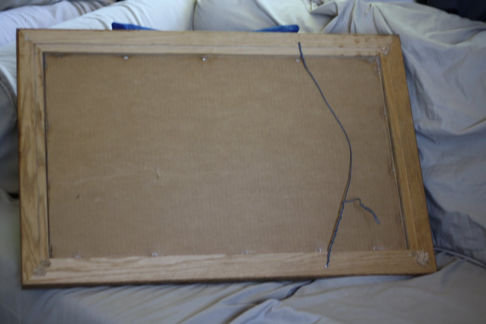
Across from the toilet is our new mirror! I took this picture standing in the shower.

And speaking of the shower.

Here is the To-Do list I never posted before. I made this list within the last month. There is very little left to do in the bathroom.

Bathroom To Do

-
Add interest piece above towel rack (Seen here)
- Add some decorative element to counter (Seen here)
- Paint Bath Toy Bin
- Create Fabric insert for Bath Toy Bin


With regards to painting the bath toy bin, I've currently dismantled the silly thing. It requires some sanding before painting so I've put the brakes on that for a day or two. Too much painting is never a good thing and we've had quite the time with paint lately.

I also haven't picked a fabric for the toy bin. It needs to be water resistant or water protected since the nature of the bin is for water related toys.

Friday, August 12, 2011

More Painting Projects

Since we picked up Martha Stewart's "Sisal" which was a perfectly light tan, I decided to repaint my "Welcome" sign.

When I began it years ago, I never finished it. It desperately needed an extra coat and I never even painted the ends!

Here it is in all its' glory now. I love it. I gave it two coats of "Sisal."

I also had this light blue "Family." In our Utah home, I had it sitting in my blue kitchen, so the color worked well. That light blue didn't shine so pretty in my living room -- which has navy tones. Since we had that gorgeous "Rich Navy" by Glidden on hand for the umbrella tin, I decided to repaint it with the navy paint.

I had to do three coats of this for it to show even. Photographing in the light, it looks "brighter" than the color is in person.

If you look at my umbrella tin navy, it is more true to the color.

An updated list of my Living Room To-Do

Living Room Still To Do:

- Hem the bottom of the curtains so they're at floor, but not piled up  (Seen here)

- Finish tie-back for the blinds  (Seen here)

- Repair the water damage on the wall under the AC unit (go bad landlord!)
- Move the boxes to the left of the media cabinet to storage
- Put new slipcovers on the sofas (when they get here agh!) (Seen here)
- Stain the furniture a nearly black color
- Add pillowcases to the throw pillows (Seen here)
- Acquire four more throw pillows
- Organize the media bookcase (buy some of these and store all of our dvd cases in storage -- cutting down on so much shelf space!) Update: We've bought two  four seven of them and want three one more to finish compiling our storage.
- Make cloth "curtain" for the media bookcase
- Acquire some sort of decorative element for the lamp shelving (Seen here and here)

- Build onto entertainment center (as seen here)
- Build entry storage case (as seen here) (Improvised here and a better shot here)
- Use extra paper from clock project to categorize the DVD storage cases.
- Finish pillowcases for new throw pillows
- Cut down dogwood branches in umbrella tin (Seen here)
- Get another basket for the shoe shelves (Seen here)
- Finish "word art" to hang above the shoe shelves
- Paint TV trays fun color like "Navy"
- Paint umbrella bucket with stripes (Navy?) (Seen here, here, and here)

- Finish "H" art to fill in hole of shoe cabinet

Thursday, August 11, 2011

Goodwill Refinish -- Part Two


Our Before

The Honky Wire

Here's the after picture.


And you can see it in all of its' glory in a new home: the bathroom.

I love this mirror now! It was worth every penny of the $3.48 at Goodwill. Every time I walk into our bathroom, it makes me smile. It looks so good in person.

Paint Color: Martha Stewart's Sisal (in Glidden Eggshell base).

You can view the progress here.

Wednesday, August 10, 2011

Goodwill Refinish -- Part One


I really hated this bare spot in our bathroom. I know that not every wall needs to be covered, but there was nothing remotely interesting going on in our bathroom. I wanted something that could be relocated anywhere in the house, so art was out. I also really didn't want to overwhelm the bathroom in art since it's such a small space.

I thought about finding a mirror. Since the mirror would have placement above the towel rack, I wanted to be sure that it wasn't the same length as the towel rack. Fortunately, we struck lucky and found a supremely cheap mirror at Goodwill ($3.48) and it's a couple inches longer than the towel rack. The frame is also real wood so it's hefty to hoist!

I didn't like the coloring and there was a sticker and vinyl car on it. Those had to go!

After a good shining with Windex, we were off to framing the mirror with Frog Tape.

We threw a coat of Primer on the mirror. It's interior primer/paint (Ultra White) by Behr in a sample size.

I then booked over to Home Depot to get a sample size of our chosen color. It's Martha Stewart's Sisal. They were out of Martha Stewart eggshell base, so they substituted Glidden's base eggshell. It's a very light sandy tan. I apologize for the color being off on screen.

I really love the color. Here's the mirror after our first coat. We're planning to add one more. The eggshell base has finishing agents in the paint so we won't need to worry about any sealant coats.

I can't wait to let this baby dry overnight and fix the wire so it can hang wide instead of high. There's holes on the wide sides so whoever had it before took it apart and changed the wire siding. We're taking it back!

I'll post pictures of the after in the next day or two when we get the final coat on and mount it. I'm in love!

Tuesday, August 9, 2011

Umbrella Tin Makeover -- Part Three

Our original plan was to tape off where the stripes would be and paint them in. B decided he would prefer to free-hand them. While I would have loved clear and crisply defined lines, I agreed because the thing I love about DIY is that there is flaws.

I'm really happy with the lines. They run fat here and there, but overall, I'm impressed with B's handiwork.

I think the umbrella tin came out beautifully!

Here's a before.

And an after. I love how rich the navy color is!

Paint Colors Used: Glidden's "Rich Navy" and Glidden's "Icy Waterfall."

To view more detailed before pictures, click here.
To view in progress pictures and details, click here.

I'm pleased to cross off another thing on my living room to-do list. I'll have to post an updated version of that list really soon!

Monday, August 8, 2011

Umbrella Tin Makeover -- Part Two


Well, the umbrella tin flowers have proved quite resilient. Brandon expressed quite a bit of frustration over the trouble they were giving him with bleed through.

After two coats of primer, I still see pink!

After the first coat of paint -- what's that, pink?

By the third coat of paint, those flowers didn't stand a chance! I breathed a real sigh of relief.

The tin is looking quite pretty, if I don't say so myself. Onto the fine detailing.

We did three coats of paint inside and outside. After that was done, B painstakingly did minor touch ups on any spots or smudged areas.

I'm in love with it. I cannot wait to add the stripes. We're also planning to make a peek-a-boo blue bottom too. It's a vanity thing as no one should ever see the bottom. In Part 3, I'll show off the completed tin in all of its' stripey glory. Ideally back in its' home and filled with umbrellas and flowers again.

Saturday, August 6, 2011

Umbrella Tin Makeover -- Part One


Say goodbye to the ugly flowers!

The tin had scuffs, chipped paint, and was very dirty. We gave it a good wipe-down with a wet washcloth.

The flowers seriously made me want to die. I've been hiding them and had placed them in permanent time-out facing my wall. I almost didn't buy this tin for $3 at Goodwill simply because of the eyesore the flowers were.

The inside paint is two coats thick. It's Glidden's Rich Navy. We're intending to add one more coat before being completely satisfied with it.

We had a different objective with the blue paint then we've used it for so far. I'm happy with our choice to make a peek-a-boo inside though!


Look at the gorgeous blending! He's putting one coat of primer from Behr on the outside.

Having a boyfriend who has painted professionally for 7+ years has it's benefits. He's my paint champion. I love how it's looking so far.

Part Two will be making a debut on Monday with a completion estimated on Tuesday. I'm thinking I might send before/after pictures to a blog I stalk: Better After.

Friday, August 5, 2011

Small Changes with Big Impact

So, I wanted to fill my new hurricane vase with something. We came upon colored glass stones. After adding them, I didn't like how hard they were to see well and appreciate. I decided I could add a flameless LED votive but came to the trouble of figuring out how to have the stones hiding the candle.

I wanted the light to illuminate the stones, not sit on them.

When thrifting today, I came across a glass that was tall, but short enough to work. It cost me $1 and is wide enough to fit a votive in. I removed all the stones, placed the glass in, and filled the stones in around it. I added some stones to the glass to create a higher platform for the votive.

Overall, I'm pleased with the light peeking through. I used one of my Halloween votives to test how it would look. It shines through the stones fine. Unfortunately, the light is orange and flickers. I need to pick up one that is white/clear and shines brightly.

But I love the touch of color. Now, I need to dust that shelf.

I'll also be revealing one of my Goodwill finds in the next few days. It's going to be getting friendly with my bathroom after it has a makeout session with some paint.

Thursday, August 4, 2011

Alphabet Photos -- Nearly Free

I finally decided it's time to print some alphabet letters and work on finally completing my art. The trouble with that is I couldn't remember for the life of me where the free letters were. Sure, you could go to Flickr's feed of alphabet photos and "take" them for your private use -- but that doesn't seem right to me.

So I searched for cheap or free ones. I found photographers selling their letter art for $40 per 2 letters. With 7 letters in B's family name, that was outrageous. I finally stumbled on these which are free to use. Although to get them through Shutterfly, you're going to pay .15 a print for a 4 x 6. Sure. That's just about free to me! I signed up for Shutterfly and they credit you 50 free 4 x 6 prints! I can get mine for free if I just pay shipping.

I'll take advantage of that 50 free prints and print some of our beach session out as well.

Now that I've ordered them, I've realized I really do need a larger frame (bummer). I can use the frame I planned on using to frame my Mom's name art which she'll enjoy. And I can get those prints for free with the 50!

So, with my 50 credits from Shutterfly, I'm printing the 7 letters for B's family name, the 4 in my family name, and 9 prints of the beach session for my hall wall. I'm looking forward to filling in some of those frames. I paid $2.05 to have 20 prints sent my way. I probably could have got them even cheaper but I'm not complaining. To my knowledge, I can still take advantage of 30 more 4 x 6 prints within the 30 days of my signing up. I'll be stewing that one over while I decide what I could want to print.

Since it was so hard to find free alphabet photographs, I decided I should link it up here. You can follow the link to the shutterfly account. There's also a flickr account here.  Pay special attention for exclamation points on the checkout page. The exclamation means the image isn't large enough to give a good quality print. I had to change two of my photos for the fear of a fuzzy photo.

I'll be posting the completed project if I ever get around to finding a suitable frame for it.

Wednesday, August 3, 2011

Another Check on my Living Room To-Do

I'm working on small details in the living room. I went to Target the other day in search of drugs for the food-poisoned boyfriend. While there, I managed to notice the clearance rack of the candle aisle. I saw three possibilities for my living room.

Medium blue pillar vase. This one wasn't really a blue that I have in my living room so it was the third runner up for me. In person, this blue is more of an aqua than the navy hue.

First place winner for me was the mosaic pillar vase. Unfortunately, the picture doesn't do it justice and it wasn't on the clearance rack. It goes from light blue to dark blue. Gorgeous!

The second place runner up for me was this jewel. It's white glass that bubbles out, with black trim around the bubbles. After picture text-messaging the sick boyfriend, this was B's favorite so it became our winner for $8.78.

I think the size is perfect for the lamp!

But then came the decision of what to put within it. My first thought was that a candle was off limits due to the light directly above it. Flowers were out because they'd block access to our light switch, which ruins practicality for me.

I finally decided that adding some colored glass stones would do the trick!

I'll post a follow-up when we complete project: fill-in decor.